UX design institute
professional diploma

Project brief
I was tasked with designing a native flight booking app, for a start-up airline, following the full UX design process.
The end goal was to create a viable, feasible & desirable solution to the problems discovered in my research.
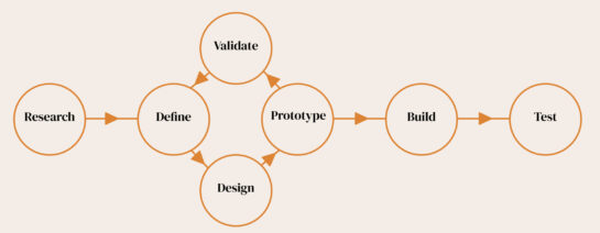
Tools & processes
Online survey - Typeform
Usability test - Letsview/Zoom
Analysis techniques - Figma/ Adobe CC/ Sketch
Interaction design - Hand sketched
Wireframes - Figma
Research
This stage helped me better understand the user, their requirements and the problems faced throughout the flight booking process. It was great to use triangulation to combine and compare my findings; to validate and consolidate recurring observations.
Competitive benchmark
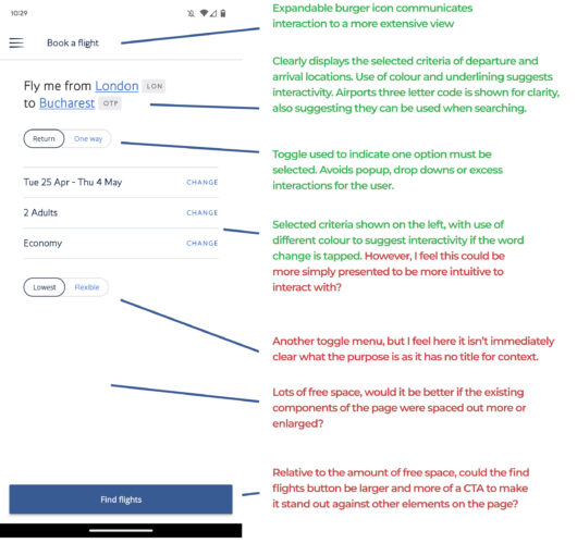
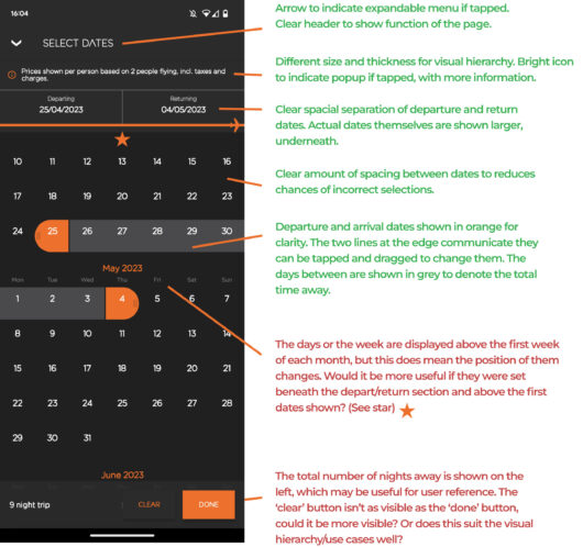
I focused on four mobile apps; three airlines, and one flight aggregator. This helped me identify what existing solutions do well and pinpoint areas for improvement. I was surprised to see, for example, that the days of the week weren't always visible when selecting dates on the EasyJet app, making it feel less intuitive when picking dates.
Online survey
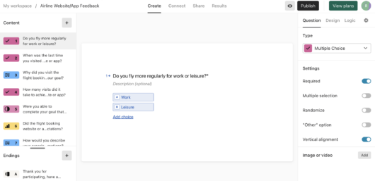
Gaining qualitative and quantitative data from actual users was useful to compare against my previous findings; validating recurring observations and highlighting areas I'd overlooked. For example, the majority of users reported a lack of satisfaction with previous experiences overall, and it was great to get the detailed feedback of why from participants.
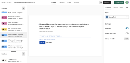
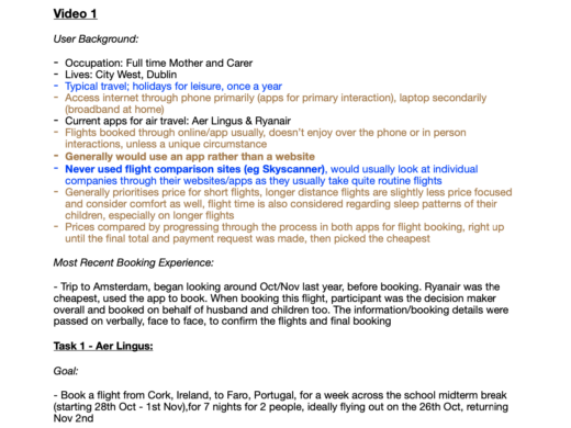
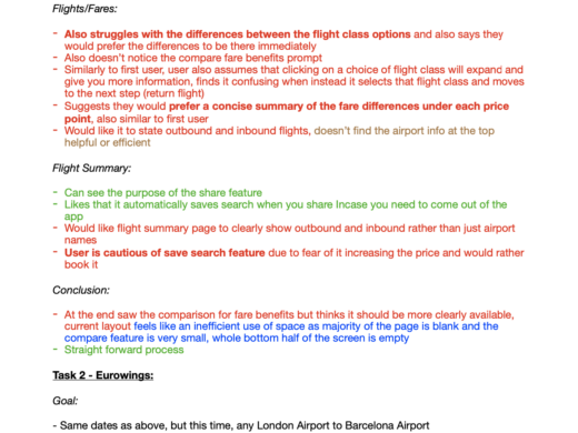
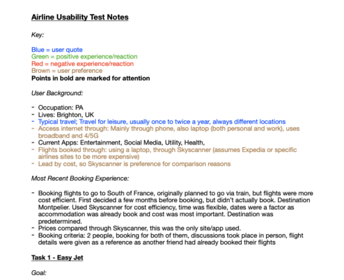
Usability test note taking
It was great to extract actual user quotes, that correlated to my previous findings, for example; the importance of clean, easy to digest layouts and hierarchies, which users stated as greatly improving their experience. It was also extremely valuable when discussing pain points, for example; what the user was expecting to see at a certain stage, and how it's absence impacted their experience.
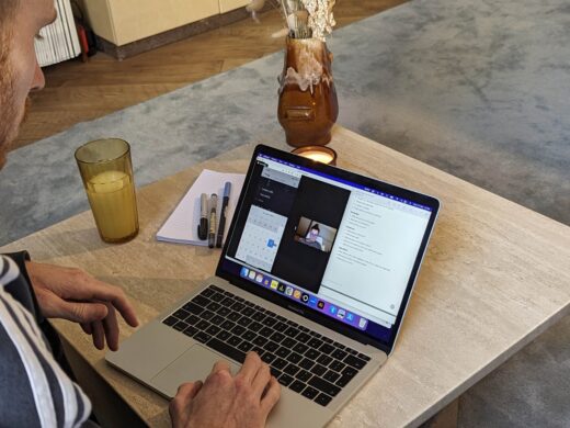
Usability test
Taking direct quotes was extremely useful when collecting this qualitative data; validating existing trends in my earlier research. There were also some unique findings, like issues with timeouts on the BA app, which users stated would immediately deter them.
Analysis techniques
This stage focused and filtered my research, clarifying where I should follow conventions to match users mental models and positive experiences. As well as revealing user pain points, where I needed to innovate solutions.
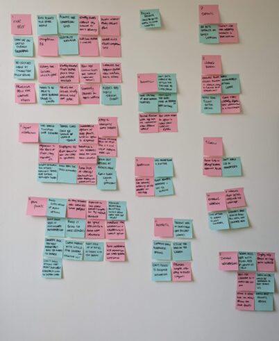
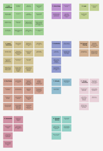
Affinity diagram
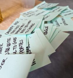
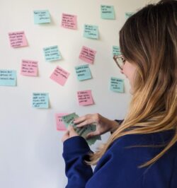
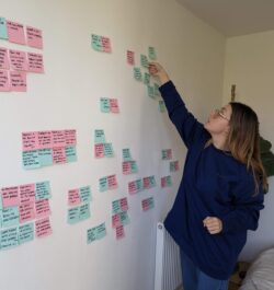
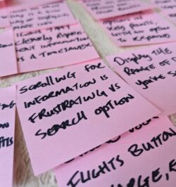
This highlighted trends, patterns and recurring themes. The quickest to spot appeared most frequently; the pain points group had numerous negative post-it's for "overcomplicated and overcrowded". However, I noticed more specific trends appeared across multiple groups. For example numerous groups had post-it's stating a preference for a search feature when selecting airports for departure/arrival, rather than scrolling.
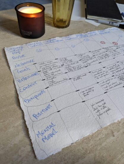
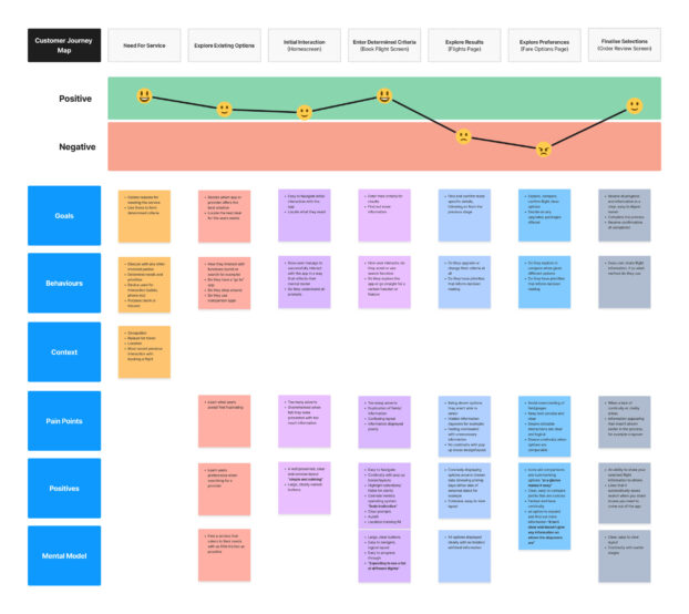
Customer journey map
This technique highlighted where existing solutions excelled; the book flight screen for example, detailed a clear expectation of conventions, that I could emulate and incorporate. It also showed the primary pain points; the flight results page and fare options, where a lot of the negative feedback was around lack of clarity and continuity.
Design
Here I addressed the problems I'd uncovered, focusing on innovating areas for improvement. It definitely felt the least linear; requiring the most experimentation, iterations and testing, but allowed me to developed informed solutions.
Flow diagram
I focused on reducing the complexity of the flight results and fare options stages. I knew I needed to make these flows as smooth, transparent and clear as possible, as these were my opportunities to improve on competitors solutions.
Interaction design
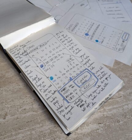
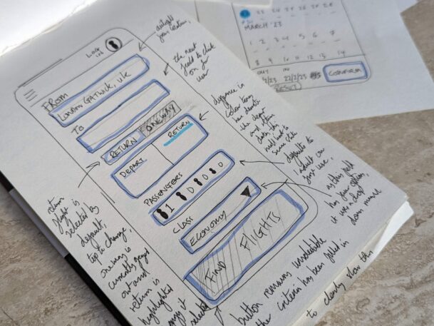
I trialled different layouts and hierarchies, specifically around the paint points I'd noticed, where there appeared to be clearer indicators of what caused issues, rather than rigid conventions. I created multiple options, then compared them to see which best aligned with my findings. I made notes for the pros and cons of each, developing the strongest until I had an improved alternative.
Prototype
Being able to rework ideas whilst testing in real time, helped fine tune my decisions when focusing on the flight results, luggage and seat options. I ended up testing numerous different flows and comparing them before developing the final one.
Information hierarchies, use cases and edge cases were some of my main focal points. Making sure the information users had flagged as most important was clearly available, with obvious prompts to access edge cases, as informed by my research.
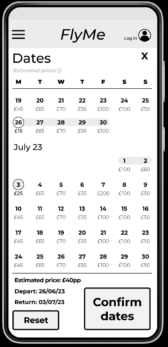
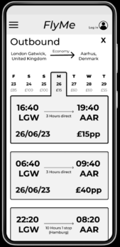
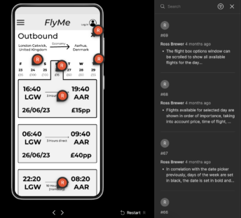
Annotated wireframe
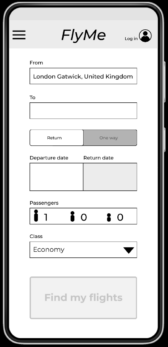
Using the comment feature, I detailed the actions, functions and rules that make up the screens and the relative flow. I focused on condensing a wealth of detail into a concise, easy to digest format. Ensuring developers could quickly and intuitively scan them.
I annotated all specifics; from pop ups and animation types, to multi state functions and rules for interactions. Having a written accompaniment to an action was useful, as it really helped test the logic of my decisions.
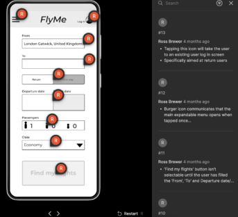
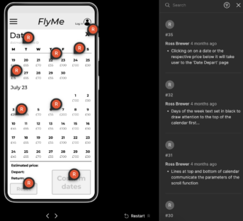
Prototype usability test
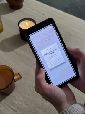
The user commented on the ease of the layouts and hierarchies. Specifically on the date picker page, there were some features like the reset button, informed by my research, that received positive feedback. The main areas I focused on; flight results and fare options, received positive feedback, especially for features such as the auto allocate and the forthcoming price information. My next steps would be further usability tests on other participants to gain more feedback, before creating a high fidelity prototype.
Reflections
- The cyclical design process can be iterated repeatedly for continual progression
- Research is critical in expanding understanding and exploring new solutions
- Gather as much information as possible; be detailed in your observations and findings
- Conventions are there to be followed
- Ensure your flow is clear, intuitive & matches the users mental model
- A mix of qualitative and quantitive data is key, you cannot rely solely on one
- A negative interaction draws more attention than a positive one
- Products should be forthcoming and accommodating
- Consistent usability testing is important when refining your solution
- Good design is frictionless
- Focus on making interaction obvious, easy, attractive & satisfying
- Fail fast, fail often; learn from your findings and data
